Monday, September 25, 2006
The professor of History of Visual Communication assigned the first writing assignment for the class. The assignment was required to write a compare and contrast essay of two typographers' ideas of ideal book design throught their lectures, Beatrice Warde's "The Crystal Goblet of Printing Should be Invisible" and William Morris's "The Ideal Book".
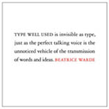
It was an absolutely hard work for me. I have repeatedly read the lectures for times, but I couldn't catch the main concept, especially Warde's. She used a vintage and goble as a metaphor for an author's mind and the type using. Type is the window to transfer author's mind to the reader, so it should be used invisibly.
I became despairing for past few days when I tried to understand the lectures. It was a simple essay; I couldn't manage well and it really made me panic for the coming final paper. I understand that I am in the process of improving: however, essays, theses, etc. don't wait for me.
